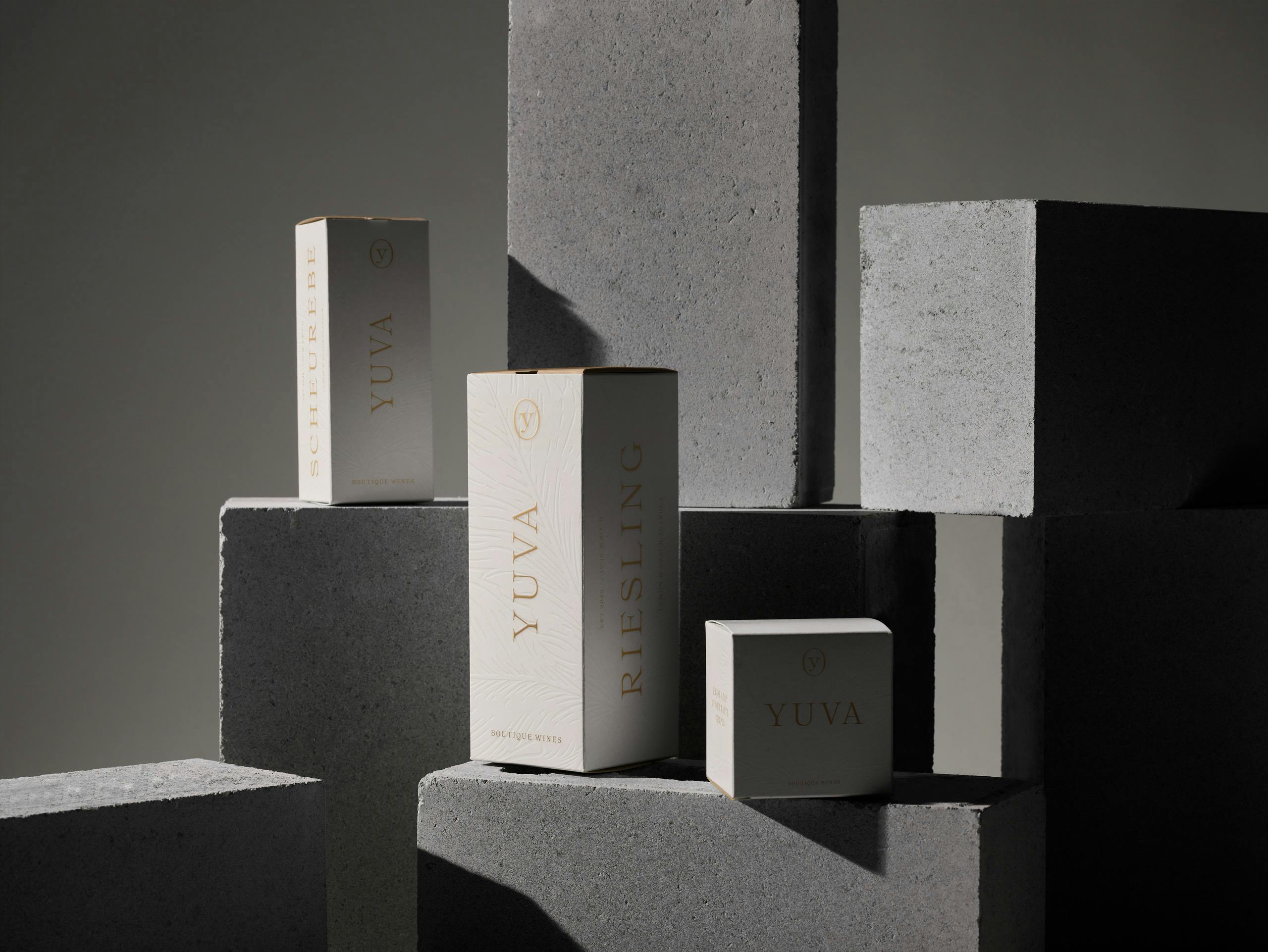
The overall goal of the creative direction was to pay tribute to the heritage of the products – the grapes and to create a reduced, still recognizable visual system. The latin word UVA translates to grapes. To archive a memorable, distinctive and recognizable name we added a Y to it as an indicator for „You“ & the uniqueness of the products itself. YUVA provides the best grapes for the individual taste of its customers.
We created a bespoke typeface that is inspired by old print specimens of the historic typeface ronaldson from the early 1900. UTF YUVA has a very sophisticated, yet natural feel with some organic touches and lettershapes that reflect the shape of grapes. The usage of only one weight combined with the minimal design visualizes the approach of the vineyard – focus on the basics, but do it great.


