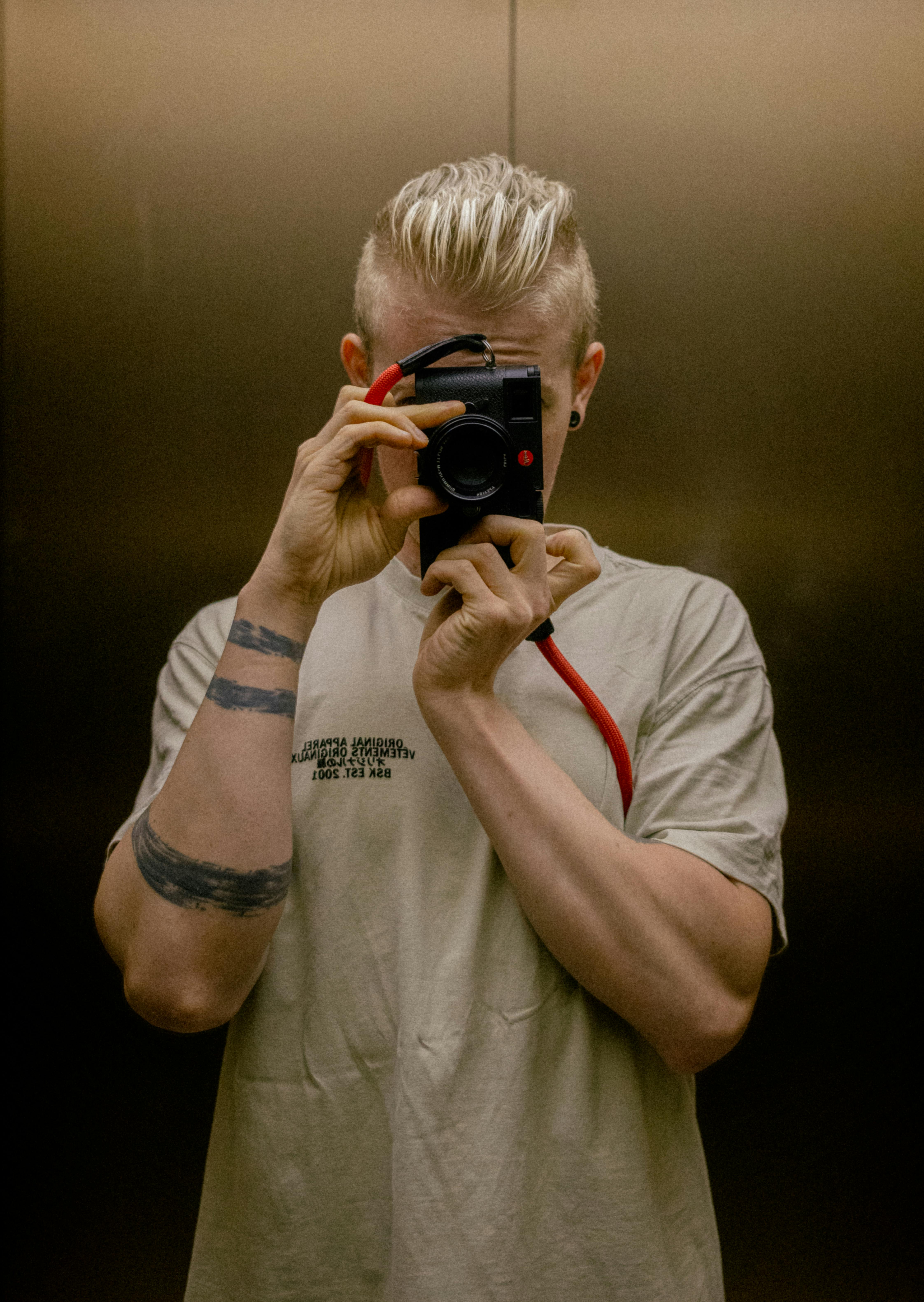
Let me show you how you can elevate your business and attract more clients.
Don’t worry! I’ll not sell you anything! Let’s talk and I give you some free tipps!


The new branding brought clarity and refined my positioning. Norman’s insightful questions played a key role in sharpening the new brand. Working with him was professional, effortless, and efficient. His structured approach, unique design style, and commitment to overdelivering made a real impact.
The new branding is now the foundation of our communication – without it, a strong presence wouldn’t be possible. His passion, high standards, and dedication to great results truly set him apart. A 10/10 experience – highly recommended!

Florian Stroh, Founder & Architect


Don’t worry! I’ll not sell you anything! Let’s talk and I give you some free tipps!